UX Writing Challenge (continued)
14 days
Final leap
Almost there! Started this in summer, I am determined to complete this challenge despite it has already past 14 days. This UX writing is on the top of my To-do list to complete along with these
- one UX usability book
- figma course
- revamp previous UX/UI C2 project to place it here
- procreate illustration courseOkie, here is the next one
Day 11
Scenario: An elderly user is doing a Google search to find an easy way to buy contact lenses online.Challenge: Write a title and meta description for a website that sells subscription contact lenses delivered to a user every 30 days—convince them to try it.Title: 60 characters max
Meta Description: 160 characters max

Images from Flaticon and Adobe Stock
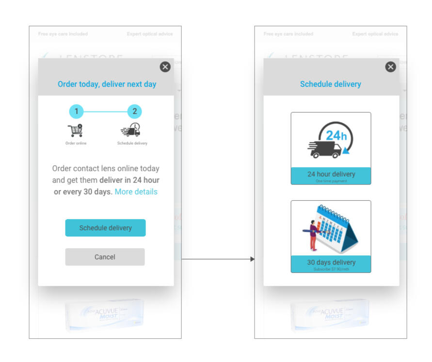
Turning this into a 2-step delivery to make it easy for the elderly user.Assumption
- In the scenario, it was assumed that the elder user knew and could order products online.
- S/he could be a new or regular user and knew exactly the product, brand and eye power to choose from.
- so the focus would be to provide user the option to schedule a 24 hr delivery or a subscription for a monthly delivery every 30 days.Approach
Left visual - User browsed the website and placed an item on the shopping cart.The dialog box appeared. User can close it and continue shopping or select the <schedule delivery> button to choose the delivery time when they are ready to place the order.Right visual - choose a 24 hour delivery or deliver every 30 days.Upon selecting the button <Schedule delivery>, the next screen will guide the user to two options which are
- 24 hr delivery (one time payment)
- 30 days delivery (Subscribe $7.90/mth)Additional useful information to add would be the savings user can get when they subscribe to the 30 days delivery.
Day 12
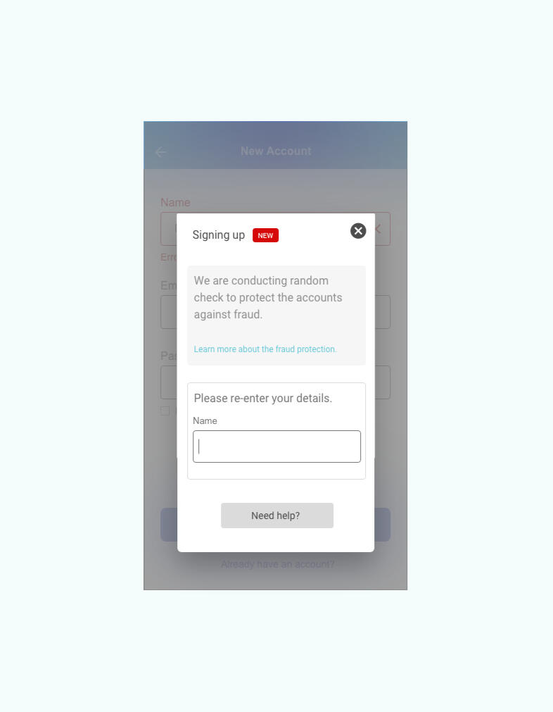
Scenario: A user is creating an account. When they come to the step where they are asked to enter their name, they get an error message. A fraud detection software thinks their name is fake—but it’s wrong 5% of the time.Challenge: Write an error message that prompts them to fix the error without shaming them for having a fake-sounding name.45 characters max

Approach
Following the brief that this is about fraud detection, a prompt appeared after user entered his/her name.The prompt should first explain the initiative on the fraud prevention conducted on a random basis and also provided a re-entry box for user to enter the name again.Additional information to learn more about this action can be useful to the users who might like to know more about this new prompt. Also in the event users need further help, they can reach out with a click on the <need help> button.
Day 13
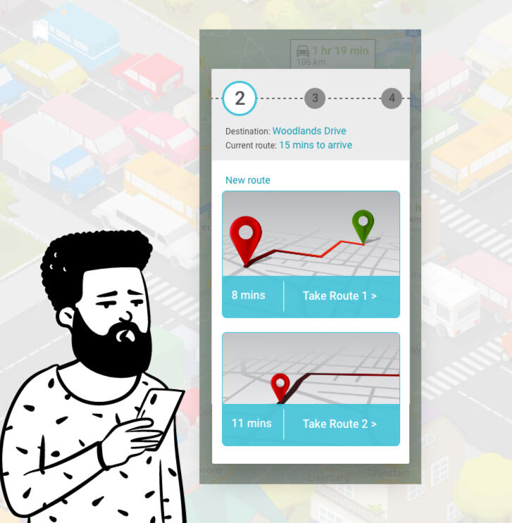
Scenario: A short-haul truck driver has a phone app that monitors his route, schedule, fuel & deliveries.
He has 6 more deliveries before stopping for fuel and lunch. Due to unexpected traffic, he’s behind schedule.
He can choose to stay on his planned route for a few more stops, but risk running low on fuel and missing lunch, or he can get fuel and lunch now and finish the deliveries later.Challenge: Write a push notification alerting him of this dilemma and options.Headline: 30 characters max
Body: 45 characters max
Button(s): 25 characters max

Images from from openpeeps and google search